
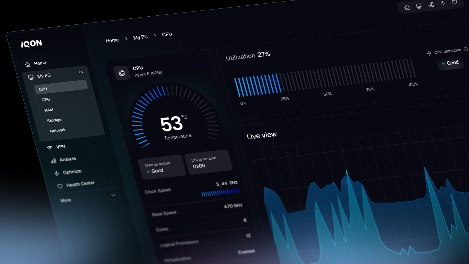
IQON is a seed-funded startup building a real-time PC monitoring desktop app — focused on clarity, performance, and visual feedback.
PlatformDesktop app
StackOnce UI · Tauri
TimelineProduction in 2 months

From stalled progress to a production-ready desktop app
IQON is building a modern PC monitoring experience — a native desktop app focused on clarity, performance, and visual feedback.
Before my involvement, the project already had strong ambitions and early design work created by an external studio. However, frontend progress had slowed, timelines were unclear, and the team needed a reliable foundation they could actually ship and build on.

That’s where I joined.
My role in the project
My focus was not redesigning the product from scratch, but executing the vision fast and correctly — translating complex, native-style designs into a real, maintainable application.
Where speed and quality collide
Lorant delivered a rock-solid frontend for our landing page and desktop app — fast, clean, and production-ready.
Zach
Founder @IQON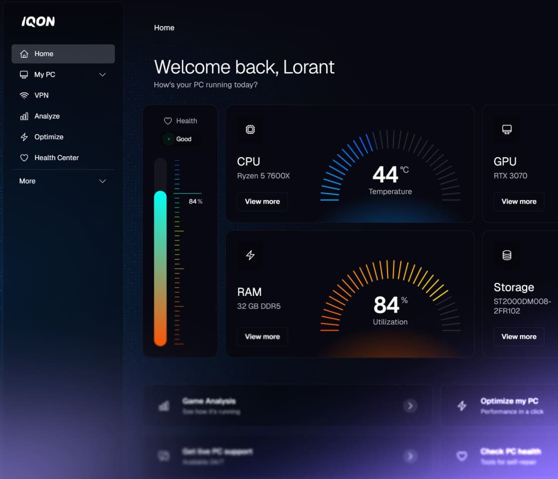
I worked on:
- Implementing the full desktop app frontend using Once UI and Next.js
- Integrating the existing backend into the new UI
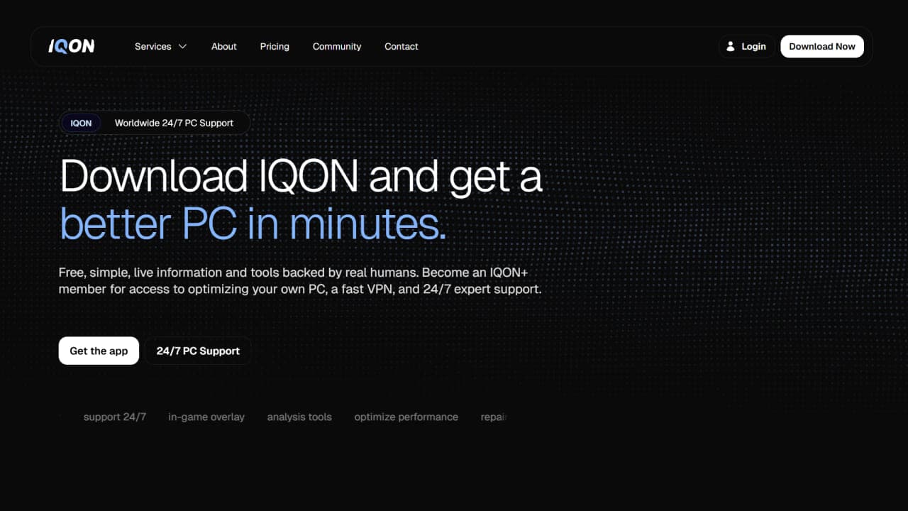
- Recreating and refining the IQON logo
- Strengthening the visual identity using Once UI effects such as MatrixFx
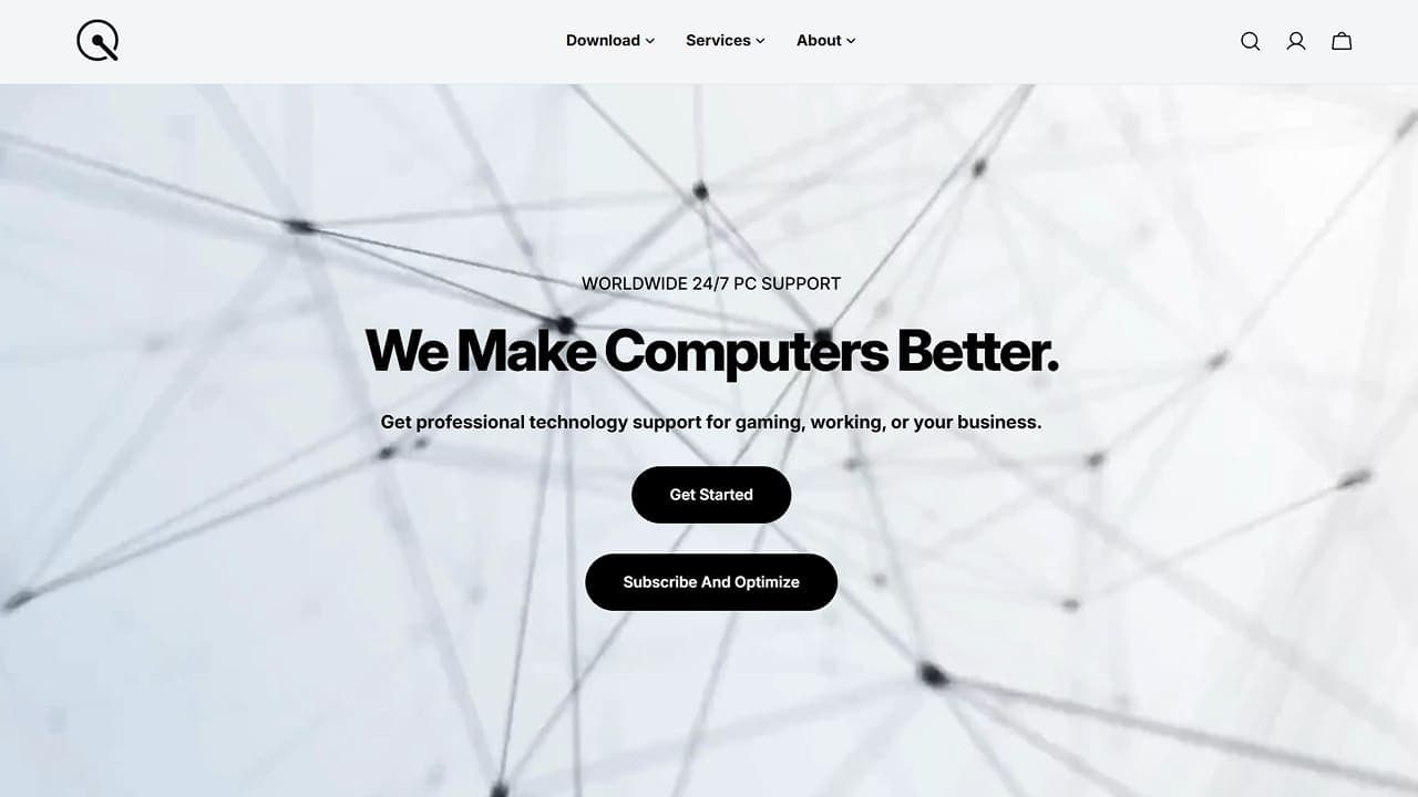
- Delivering a production-ready landing page alongside the app
- Establishing a clean, modular, component-based architecture for future features
While the designs originated elsewhere, the responsibility for turning them into a functional, native-feeling desktop application — and doing so quickly — sat with me.
A focus on foundations, not shortcuts
From day one, the goal was to avoid the kind of technical debt that slows teams down later.
That meant:
- no legacy patterns
- no tightly coupled components
- no rushed hacks to “just make it work”
Instead, the app was built with:
- clear separation of concerns
- reusable, composable components
- predictable data flow
- a structure that IQON’s internal team could easily extend
After handoff, their developers were able to fine-tune, polish, and continue development without needing to rewrite or untangle the frontend.
A system I’d choose again
After building UIs with tools from Windows Forms to Tailwind, Once UI stands out. It’s flexible and very easy to pick up.
Chander L. Miller
Senior Engineer, Founder @IQON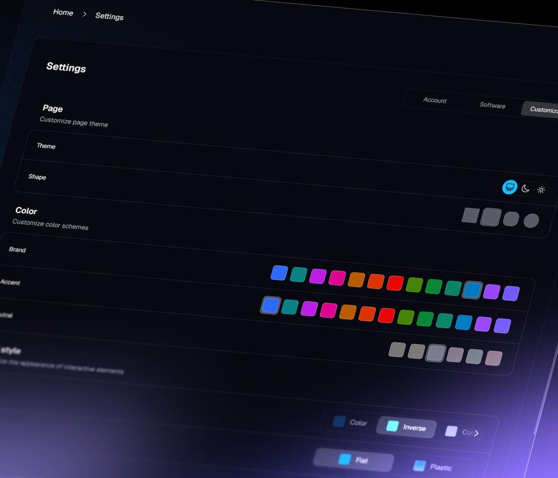
Branding through system-level design
A key part of IQON’s identity is how it feels — modern, technical, and precise.
Rather than relying on custom one-off visuals, the branding leaned heavily on Once UI’s system-level effects, such as MatrixFx, gradients, and motion primitives. This allowed the app and landing page to feel cohesive while remaining flexible and maintainable.
The outcome
In roughly two months, IQON went from fragmented progress to:
- a production-ready desktop app frontend
- a polished landing page
- a clean, extensible codebase
- a UI foundation capable of supporting rapid feature development
What had previously taken months without a clear endpoint was replaced with momentum, clarity, and a shippable product.
Why this worked
This project wasn’t fast because of shortcuts.
It was fast because the frontend was built on a system designed for speed and consistency.
pre-defined layout and component structure
consistent design tokens and visual rules
reusable building blocks across app and landing
no need to reinvent patterns or debug inconsistencies
Instead of designing and building from scratch, we assembled a system that was already aligned.
That’s what Once UI enables.
In short
- $10k frontend system delivered
- Production-ready in 2 months
- Desktop app + landing page
- Built on reusable systems by Once UI
Looking ahead
With the frontend foundations in place, IQON is now focused on expanding functionality, refining performance insights, and continuing to evolve the product experience — without being held back by early technical decisions.
For me, this project reinforced the value of combining a strong design system with focused execution: when the UI layer is done right, entire teams move faster.
— Lorant
Design Engineers WeeklyLearn about design, development and business


